# Standard normal distribution parameters
mu <- 0
sigma <- 1
# Standard Normal Distribution: μ = 0, σ = 1Lab 4: Continuous Random Variables and Normal Distribution
Student Name:
Introduction: Continuous Probability Distributions
This laboratory explores continuous probability distributions with a focus on the normal distribution: the most important continuous distribution in statistics. We will examine normal distribution properties, probability calculations, and the relationship between theoretical distributions and empirical samples.
Learning Objectives
Upon completion of this laboratory, students will be able to:
- Understand and apply the normal distribution probability density function
- Calculate probabilities and percentiles for normal distributions using R
- Visualize normal distributions with different parameters
- Generate random samples and compare them to theoretical distributions
- Interpret how standard deviation affects distribution shape and spread
- Apply normal distribution concepts to real-world scenarios
Time Allocation (Total: 100 minutes)
- Part 1: Normal Distribution Fundamentals (35 minutes)
- Part 2: Probability Calculations and Applications (35 minutes)
- Part 3: Sampling and Empirical Distributions (30 minutes)
Part 1: Normal Distribution Fundamentals
1.1 Normal Distribution Theory
The normal distribution is characterized by its bell-shaped curve and defined by the probability density function:
where μ is the mean and σ is the standard deviation.
1.2 Standard Normal Distribution Visualization
Visualizing the standard normal distribution using ggplot2.
Practice Exercise: Run the code below to create your first normal distribution visualization. Notice how we use dnorm() to calculate density values.
# Standard normal distribution plot
x_values <- seq(-4, 4, length = 200)

standard_normal <- tibble(
  x = x_values,
  density = dnorm(x_values, mean = 0, sd = 1),
  distribution = pnorm(x_values, mean = 0, sd = 1)
)

# Density function plot
ggplot(standard_normal, aes(x, density)) +
  geom_line(color = "steelblue", size = 1.2) +
  labs(title = "Standard Normal Distribution (μ=0, σ=1)",
       subtitle = "Probability Density Function",
       x = "Z-score", y = "Density") +
  theme_minimal(base_size = 10) +
  geom_vline(xintercept = 0, linetype = "dashed", color = "red")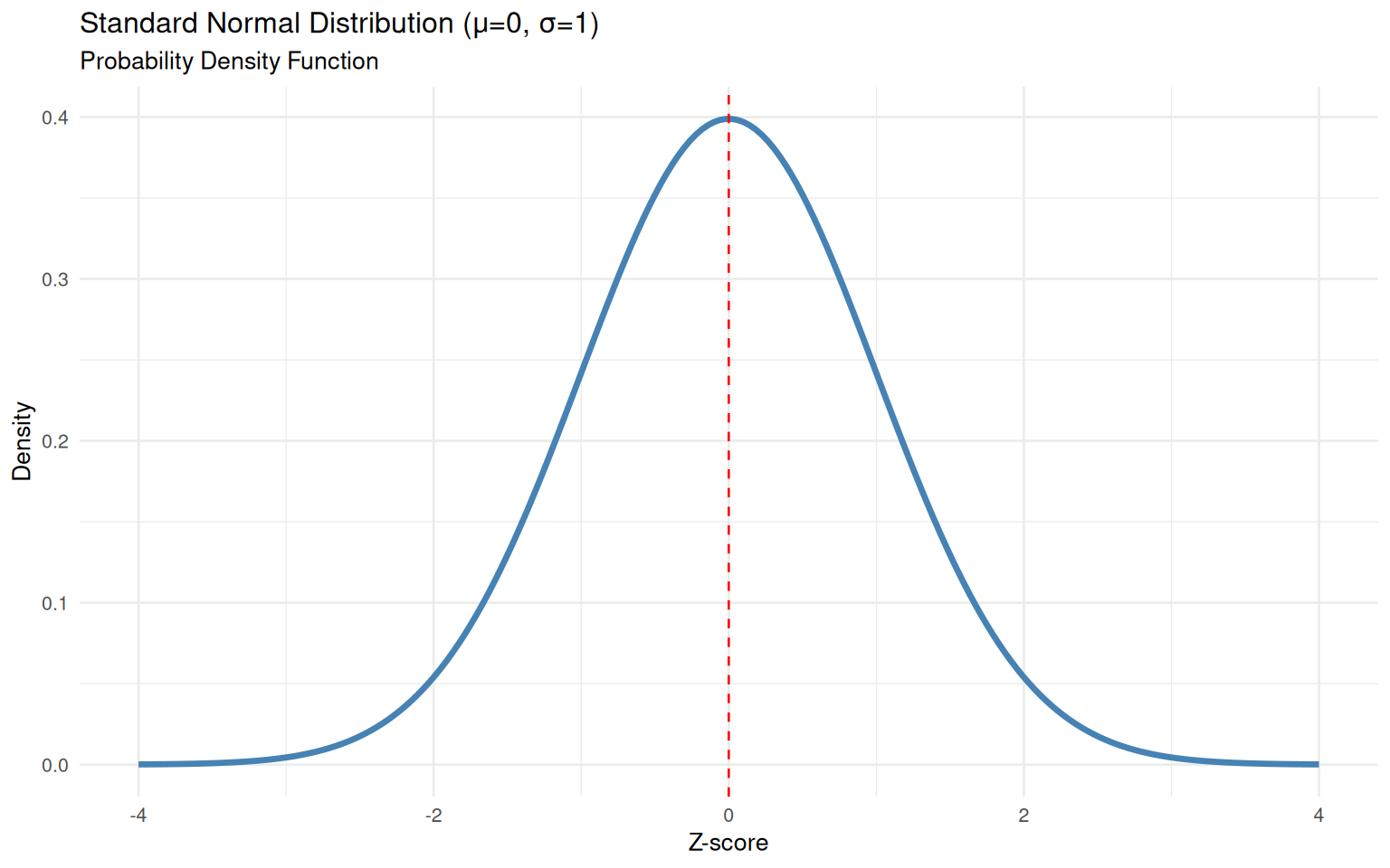
1.3 Guided Practice: Probability Visualization Function
Let’s learn a helpful function that we’ll use throughout this lab. The visualize_probability() function creates beautiful visualizations of probability regions.
Understanding the Function: This function takes a lower bound, upper bound, mean, and standard deviation, then creates a plot showing the probability region shaded in color.
# Function to visualize probability regions - USE THIS IN YOUR ASSESSMENT!
visualize_probability <- function(lb, ub, mean = 0, sd = 1) {
  x_seq <- seq(mean - 4*sd, mean + 4*sd, length = 300)
  df <- tibble(x = x_seq, density = dnorm(x_seq, mean, sd))

  prob <- pnorm(ub, mean, sd) - pnorm(lb, mean, sd)

  ggplot(df, aes(x, density)) +
    geom_line(color = "navy", size = 1) +
    geom_area(data = subset(df, x >= lb & x <= ub),
              aes(y = density), fill = "red", alpha = 0.5) +
    labs(title = paste("P(", lb, " ≤ X ≤ ", ub, ") =", round(prob, 4)),
         subtitle = paste("Normal Distribution: μ =", mean, ", σ =", sd),
         x = "Value", y = "Density") +
    theme_minimal(base_size = 10)
}

# Try it out: Visualize P(-1 ≤ X ≤ 1) for standard normal
visualize_probability(-1, 1, 0, 1)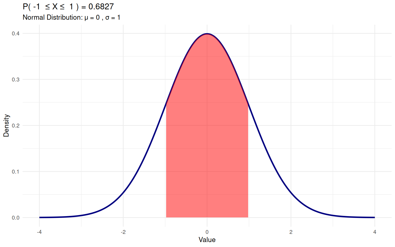
Quick Check: What probability does this visualization show? Look at the title of the plot!
1.4 Effect of Standard Deviation on Distribution Shape
Examining how different standard deviations affect the normal distribution.
# Normal distributions with different standard deviations
sigma_values <- c(0.5, 1, 2)
distribution_data <- map_df(sigma_values, ~{
  x_seq <- seq(-6, 6, length = 200)
  tibble(
    x = x_seq,
    density = dnorm(x_seq, mean = 0, sd = .x),
    sigma = paste("σ =", .x)
  )
})

ggplot(distribution_data, aes(x, density, color = sigma)) +
  geom_line(size = 1.2) +
  labs(title = "Normal Distributions with Different Standard Deviations",
       subtitle = "All distributions have mean μ = 0",
       x = "Value", y = "Density", color = "Standard Deviation") +
  theme_minimal(base_size = 10) +
  scale_color_brewer(palette = "Set1")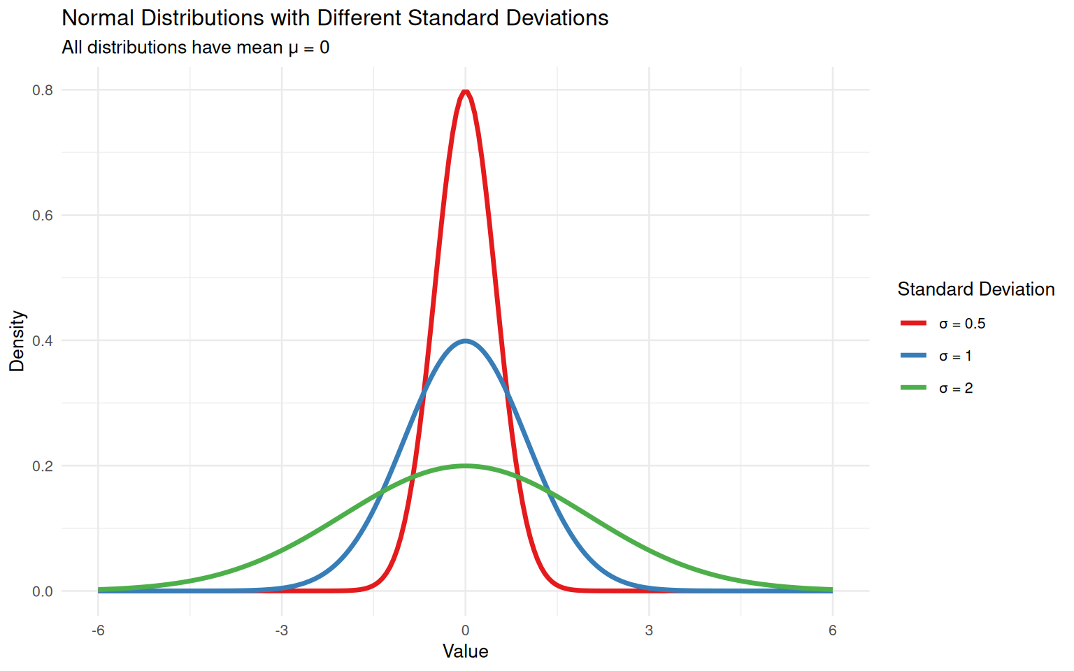
Part 2: Probability Calculations and Applications
2.1 Basic Probability Calculations
Using R’s normal distribution functions for probability calculations.
# Probability calculations examples for standard normal distribution
# P(X ≤ 2) - probability that X is less than or equal to 2
pnorm(2, 0, 1)
[1] 0.9772499# P(-2 ≤ X ≤ 2) - probability that X is between -2 and 2
pnorm(2, 0, 1) - pnorm(-2, 0, 1)[1] 0.9544997# P(X > 1.5) - probability that X is greater than 1.5
1 - pnorm(1.5, 0, 1)[1] 0.0668072# 95th percentile - value below which 95% of data falls
qnorm(0.95, 0, 1)[1] 1.644854Understanding the Results: Run each line separately and observe the output values. These are fundamental probability calculations you’ll use in Assessment B!
2.2 Visualizing Probability Regions
Now let’s use the visualize_probability() function we learned earlier to highlight specific probability regions.
Practice: Use the function to visualize P(-2 ≤ X ≤ 2) for the standard normal distribution.
# Example: P(-2 ≤ X ≤ 2) for standard normal
visualize_probability(-2, 2)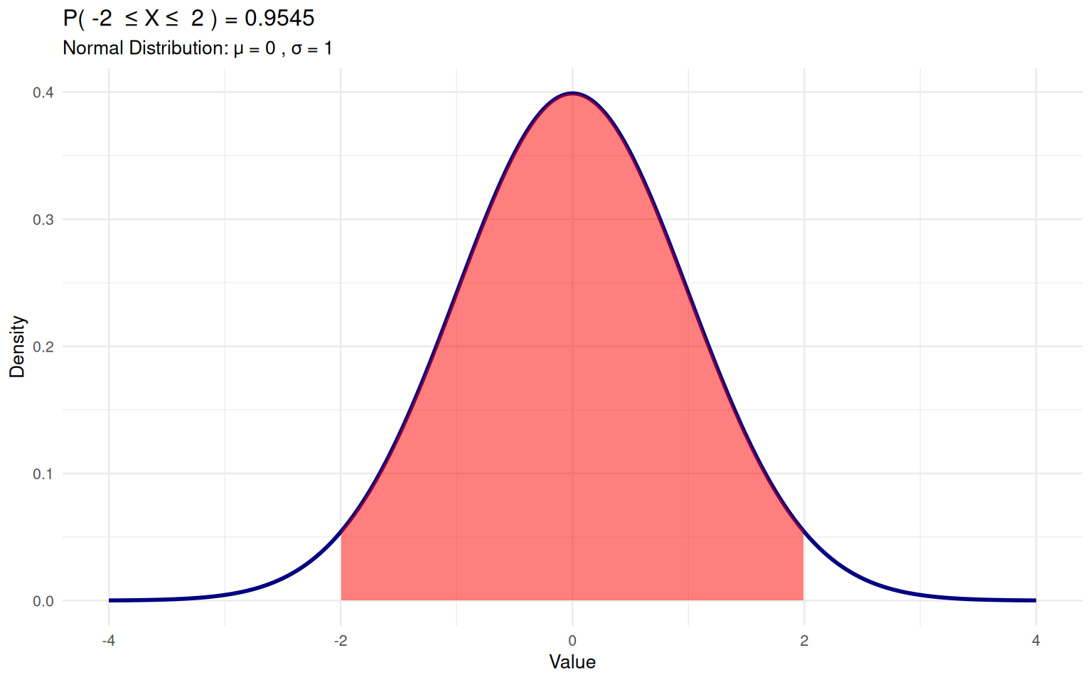
2.3 Real-world Application Examples
Applying normal distribution concepts to practical scenarios.
Example 1: Test Score Analysis Test scores are normally distributed with μ=75, σ=10. Let’s calculate some key probabilities:
# Test Score Analysis (μ=75, σ=10)
# Probability of scoring above 85
1 - pnorm(85, 75, 10)
[1] 0.1586553# Probability of scoring between 65 and 85
pnorm(85, 75, 10) - pnorm(65, 75, 10)[1] 0.6826895# Top 10% cutoff score
qnorm(0.9, 75, 10)[1] 87.81552Now let’s visualize this test score distribution with the top 10% cutoff marked:
# Visualize test score distribution
test_scores <- tibble(x = seq(45, 105, length = 200),
                         density = dnorm(seq(45, 105, length = 200), 75, 10))

ggplot(test_scores, aes(x, density)) +
  geom_line(color = "darkgreen", size = 1.2) +
  geom_vline(xintercept = qnorm(0.9, 75, 10), linetype = "dashed", color = "red") +
  annotate("text", x = 88, y = 0.02, label = "Top 10% cutoff", color = "red") +
  labs(title = "Test Score Distribution (μ=75, σ=10)",
       x = "Test Score", y = "Density") +
  theme_minimal(base_size = 10)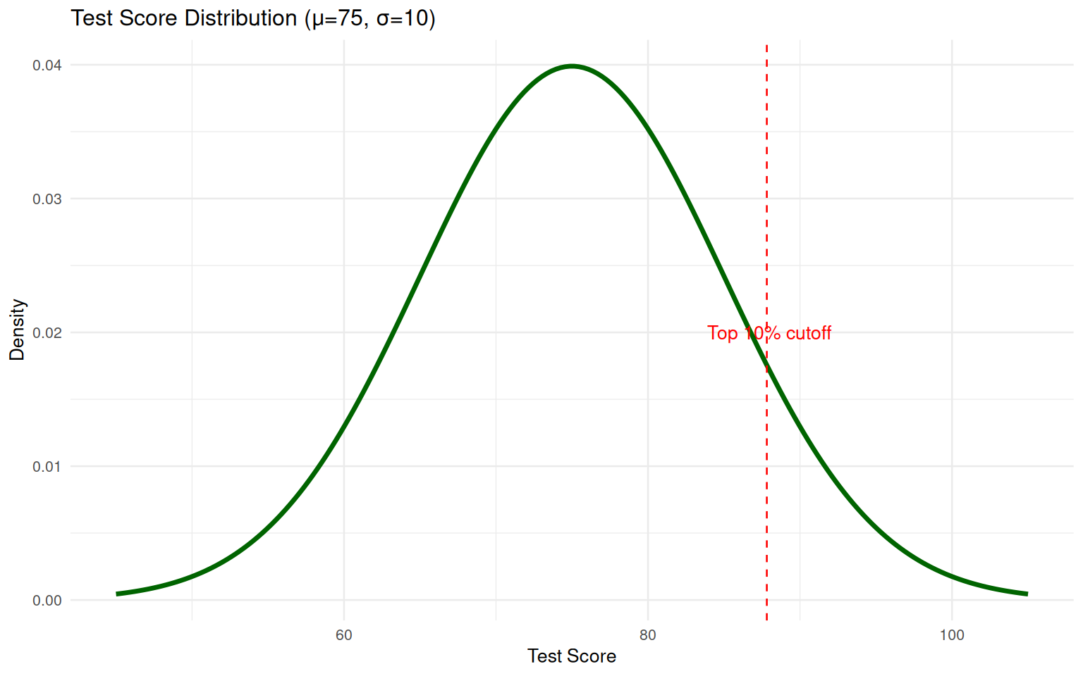
Part 3: Sampling and Empirical Distributions
3.1 Sampling from Normal Distributions
Generating random samples and comparing them to theoretical distributions.
# Generate samples of different sizes
set.seed(214)  # For reproducibility
sample_sizes <- c(25, 100, 1000)

sample_plots <- map(sample_sizes, ~{
  sample_data <- rnorm(.x, mean = 0, sd = 1)

  ggplot(tibble(value = sample_data), aes(x = value)) +
    geom_histogram(aes(y = ..density..), bins = 15,
                   fill = "lightblue", color = "black", alpha = 0.7) +
    stat_function(fun = dnorm, args = list(mean = 0, sd = 1),
                 color = "red", size = 1.2) +
    labs(title = paste("Sample Size:", .x),
         x = "Value", y = "Density") +
    theme_minimal(base_size = 10)
})

grid.arrange(grobs = sample_plots, ncol = 2)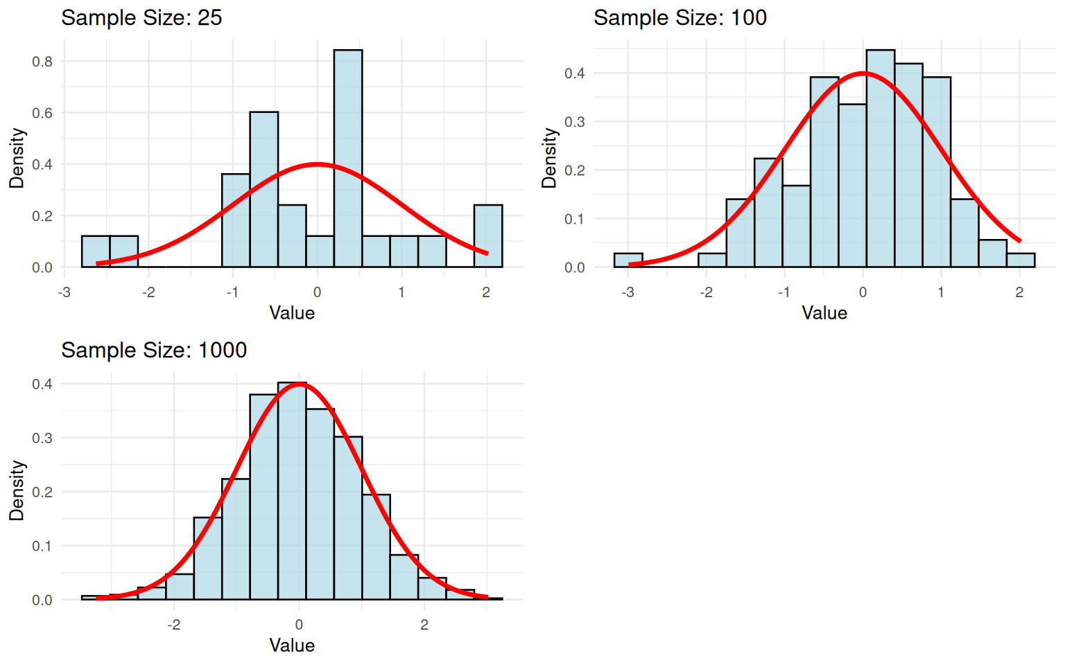
3.2 Large Sample Properties
Examining how sample size affects the resemblance to theoretical distribution.
# Large sample comparison
large_sample <- rnorm(10000, mean = 100, sd = 15)

ggplot(tibble(value = large_sample), aes(x = value)) +
  geom_histogram(aes(y = ..density..), bins = 30,
                 fill = "orange", color = "black", alpha = 0.7) +
  stat_function(fun = dnorm, args = list(mean = 100, sd = 15),
               color = "blue", size = 1.5) +
  labs(title = "Large Sample (n=10,000) vs Theoretical Normal Distribution",
       subtitle = "Population: μ=100, σ=15",
       x = "Value", y = "Density") +
  theme_minimal(base_size = 10)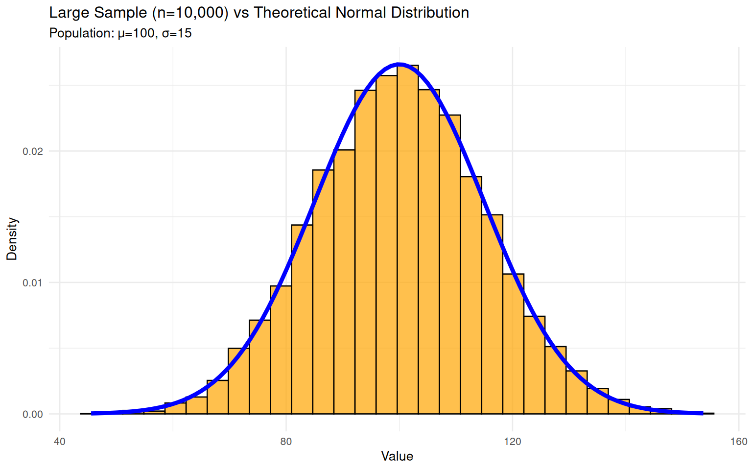
3.3 Distribution Comparison Analysis
Comparing distributions with different parameters.
# Compare two normal distributions with same mean, different SDs
comparison_data <- tibble(
  x = seq(50, 150, length = 200),
  dist_A = dnorm(seq(50, 150, length = 200), 100, 20),
  dist_B = dnorm(seq(50, 150, length = 200), 100, 10)
) %>%
  pivot_longer(cols = c(dist_A, dist_B),
               names_to = "Distribution",
               values_to = "Density")

ggplot(comparison_data, aes(x, Density, color = Distribution)) +
  geom_line(size = 1.2) +
  labs(title = "Comparison of Normal Distributions",
       subtitle = "Both with μ=100, Distribution A: σ=20, Distribution B: σ=10",
       x = "Value", y = "Density") +
  theme_minimal(base_size = 10) +
  scale_color_manual(values = c("red", "blue"),
                     labels = c("σ=20", "σ=10"))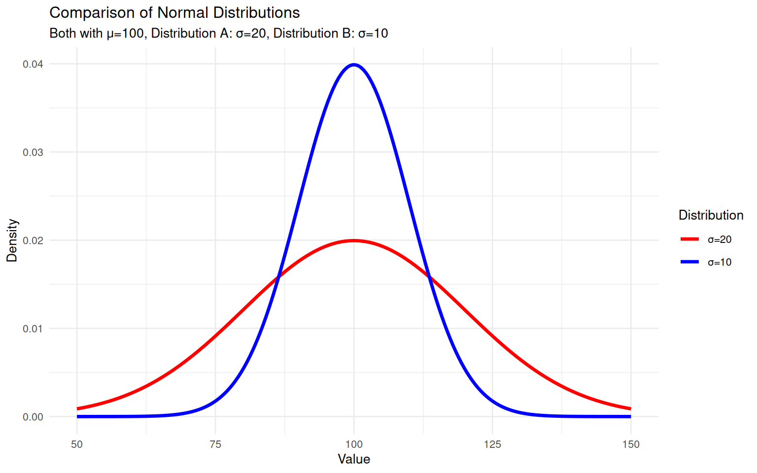
Assessment (Total: 50 points)
Section A: Formative Understanding (15 points)
A1. Explain the key properties of the normal distribution and why it is so important in statistics. Include discussion of the empirical rule (68-95-99.7 rule). (4 points)
A2. Describe how changes in the standard deviation parameter affect the shape and spread of a normal distribution. Provide visual examples to support your explanation. (4 points)
A3. Compare and contrast the probability density function (PDF) and cumulative distribution function (CDF) for normal distributions. When would you use each in practical applications? (4 points)
A4. Discuss the relationship between sample size and how well empirical distributions approximate theoretical normal distributions. What sample size is typically needed for good approximation? (3 points)
Section B: Guided Coding Practice (20 points)
B1. Step-by-Step Probability Calculation (4 points) For a normal distribution with μ=68 and σ=2.5, calculate the probability that a random variable falls between 64 and 70. Use the visualize_probability() function we learned earlier.
# Step 1: Calculate the probability using pnorm()
# P(64 ≤ X ≤ 70) for N(68, 2.5)
# [Your code here]

# Step 2: Visualize using our function
# [Your code here]
B2. Finding Symmetric Probability Intervals (4 points) Find the value x such that P(-x < X < x) = 0.95 for a standard normal distribution.
# Step 1: Think about the problem
# For P(-x < X < x) = 0.95, we need 2.5% in each tail
# So we need the 97.5th percentile (100% - 2.5% = 97.5%)

# Step 2: Calculate using qnorm()
# [Your code here]

# Step 3: Verify by checking the probability
# [Your code here]
B3. Probability and Percentile Practice (4 points) Given a normal distribution with μ=50 and σ=10, calculate P(X < 45) and find the 75th percentile.
# Step 1: Calculate P(X < 45)
# [Your code here]

# Step 2: Find the 75th percentile
# [Your code here]

# Step 3: Create visualization (optional challenge)
# Hint: Use visualize_probability() for the probability,
# then add a vertical line for the percentile
# [Your code here]
B4. Comparing Two Distributions (4 points) Compare two normal distributions with the same mean but different standard deviations.
# Distribution A: μ=100, σ=20
# Distribution B: μ=100, σ=10
# Calculate P(X < 90) for both

# [Your code here]

# Display results
# [Your code here]

# Which distribution has the higher probability? Why?
# [Your explanation here]
B5. Sample Size Exploration (4 points) Generate samples from a normal distribution and observe how sample size affects the approximation.
# Set seed for reproducibility
set.seed(214)

# Generate samples of different sizes
# [Your code here]

# Create histogram for n=1000 (largest sample)
# [Your code here]
Section C: Statistical Synthesis (15 points)
C1. Write a comprehensive report (200-250 words) discussing practical applications of the normal distribution in real-world scenarios such as quality control, test scoring, and biological measurements. Include specific examples and explain how parameter estimation works in these contexts. (7 points)
C2. Design a complete statistical analysis plan for a manufacturing quality control study using normal distributions. Specify the research questions, data collection methods, appropriate normal distribution parameters, and analytical approaches. (4 points)
C3. Reflect on the limitations of assuming normality in real-world data. What diagnostic tools and alternative approaches should researchers consider when dealing with non-normal data? (4 points)
Submission Guidelines:
- Complete R Markdown document with all code and outputs
- Properly formatted visualizations and statistical summaries
- Professional writing with clear analytical narrative
- Knitted HTML document submitted via designated platform