# Importing the Pulse dataset
# Data URL: https://math214.netlify.app/data/Lab2/pulse.csv
pulse_data <- read.csv("../data/Lab2/pulse.csv")Lab 2: Categorical Variables and Probability
Student Name:
Introduction: Categorical Data Analysis and Probability Fundamentals
This laboratory builds upon descriptive statistics foundations to explore categorical variable analysis, probability concepts, and their application in medical research contexts. We will analyze relationships between categorical variables using both numerical summaries and visual representations.
Learning Objectives
Upon completion of this laboratory, students will be able to:
- Transform categorical variables for meaningful analysis
- Create and interpret frequency distributions and cross-tabulations
- Construct and analyze pie charts and bar charts for categorical data
- Calculate and interpret basic probabilities from contingency tables
- Apply conditional probability concepts to real-world scenarios
- Understand independence and dependence between categorical variables
Time Allocation (Total: 100 minutes)
- Part 1: Categorical Data Preparation and Visualization (35 minutes)
- Part 2: Cross-Tabulation and Probability Concepts (35 minutes)
- Part 3: Probability Applications (30 minutes)
Part 1: Categorical Data Preparation and Visualization
1.1 Data Import and Initial Exploration
We will use the Pulse dataset to examine relationships between categorical variables in a medical research context.
The dataset comprises eight variables:
- Pulse1: Resting pulse rate of each student.
- Pulse2: Pulse rate after the activity or rest period (post-treatment).
- Ran: Indicates whether the student ran in place (1=Yes, 2=No).
- Smokes: Regular smoking status (1=Yes, 2=No).
- Sex: Biological gender (1=M, 2=F).
- Height: Student’s height in inches.
- Weight: Student’s weight in pounds.
- Activity: Typical activity level (1=Slight, 2=Moderate, 3=A lot).
1.2 Categorical Variable Transformation
Recoding numerical codes to meaningful categorical labels enhances interpretability.
# Recoding categorical variables
pulse_data <- pulse_data |>
  mutate(
    Sex = case_when(
      Sex == 1 ~ "Male",
      Sex == 2 ~ "Female"),
    Activity = case_when(
      Activity == 1 ~ "Slight",
      Activity == 2 ~ "Moderate",
      Activity == 3 ~ "A lot"),
    Smokes = case_when(
      Smokes == 1 ~ "Yes",
      Smokes == 2 ~ "No"),
    Ran = case_when(
      Ran == 1 ~ "Yes",
      Ran == 2 ~ "No")
  )

# Verify transformations
head(pulse_data |> select(Sex, Activity, Smokes, Ran), 5) |> knitr::kable()| Sex | Activity | Smokes | Ran |
|---|---|---|---|
| Male | Moderate | No | Yes |
| Male | Moderate | No | Yes |
| Male | A lot | Yes | Yes |
| Male | Slight | Yes | Yes |
| Male | Moderate | No | Yes |
1.3 Frequency Distributions and Proportions
Understanding the distribution of categorical variables through counts and proportions.
# Frequency distribution of Sex
sex_distribution <- pulse_data |>
  count(Sex) |>
  mutate(Proportion = n / sum(n))

sex_distribution |>
knitr::kable()| Sex | n | Proportion |
|---|---|---|
| Female | 35 | 0.3804348 |
| Male | 57 | 0.6195652 |
# Frequency distribution of Activity levels
activity_distribution <- pulse_data |>
  count(Activity) |>
  mutate(Proportion = n / sum(n)) |>
  arrange(desc(n))

activity_distribution |>
knitr::kable()| Activity | n | Proportion |
|---|---|---|
| Moderate | 61 | 0.6630435 |
| A lot | 21 | 0.2282609 |
| Slight | 10 | 0.1086957 |
1.4 Data Visualization for Categorical Variables
Visual representations enhance understanding of categorical data distributions.
# Pie chart for Sex distribution
ggplot(sex_distribution, aes(x = "", y = Proportion, fill = Sex)) +
  geom_bar(stat = "identity", width = 1) +
  coord_polar("y", start = 0) +
  theme_void() +
  geom_text(aes(label = paste0("Count: ", n, "\n", percent(Proportion))),
            position = position_stack(vjust = 0.5)) +
  labs(title = "Gender Distribution in Pulse Study") +
  scale_fill_brewer(palette = "Set2")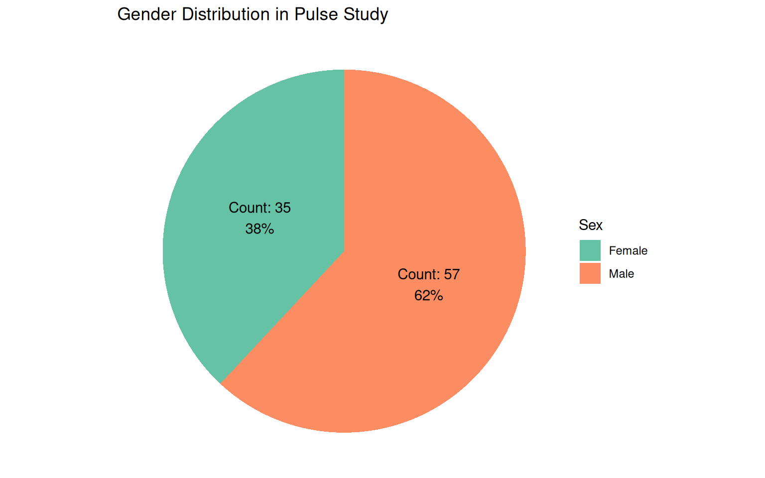
# Bar chart for Activity levels
ggplot(activity_distribution, aes(x = reorder(Activity, -n), y = n, fill = Activity)) +
  geom_bar(stat = "identity", alpha = 0.8) +
  geom_text(aes(label = n), vjust = -0.5, size = 4) +
  labs(title = "Activity Level Distribution",
       x = "Activity Level",
       y = "Number of Students") +
  theme_minimal(base_size = 10) +
  theme(legend.position = "none") +
  scale_fill_brewer(palette = "Set3")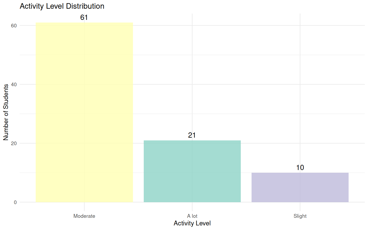
Part 2: Cross-Tabulation and Probability Concepts
2.1 Cross-Tabulation Analysis
Examining relationships between two categorical variables through contingency tables.
# Cross-tabulation: Sex vs Activity
sex_activity_table <- pulse_data |>
  count(Sex, Activity) |>
  pivot_wider(names_from = Activity, values_from = n, values_fill = 0)

sex_activity_table |> knitr::kable()| Sex | A lot | Moderate | Slight |
|---|---|---|---|
| Female | 5 | 26 | 4 |
| Male | 16 | 35 | 6 |
# Cross-tabulation with proportions
sex_activity_prop <- pulse_data |>
  count(Sex, Activity) |>
  group_by(Sex) |>
  mutate(Proportion = n / sum(n))

sex_activity_prop |> knitr::kable()| Sex | Activity | n | Proportion |
|---|---|---|---|
| Female | A lot | 5 | 0.1428571 |
| Female | Moderate | 26 | 0.7428571 |
| Female | Slight | 4 | 0.1142857 |
| Male | A lot | 16 | 0.2807018 |
| Male | Moderate | 35 | 0.6140351 |
| Male | Slight | 6 | 0.1052632 |
2.2 Visualizing Relationships Between Categorical Variables
Stacked and grouped bar charts reveal patterns in bivariate categorical relationships.
# Stacked bar chart: Activity by Sex
ggplot(pulse_data, aes(x = Sex, fill = Activity)) +
  geom_bar(position = "stack", alpha = 0.8) +
  labs(title = "Activity Level Distribution by Gender",
       subtitle = "Stacked bar chart showing composition",
       x = "Gender",
       y = "Count",
       fill = "Activity Level") +
  theme_minimal(base_size = 10) +
  scale_fill_brewer(palette = "Set3")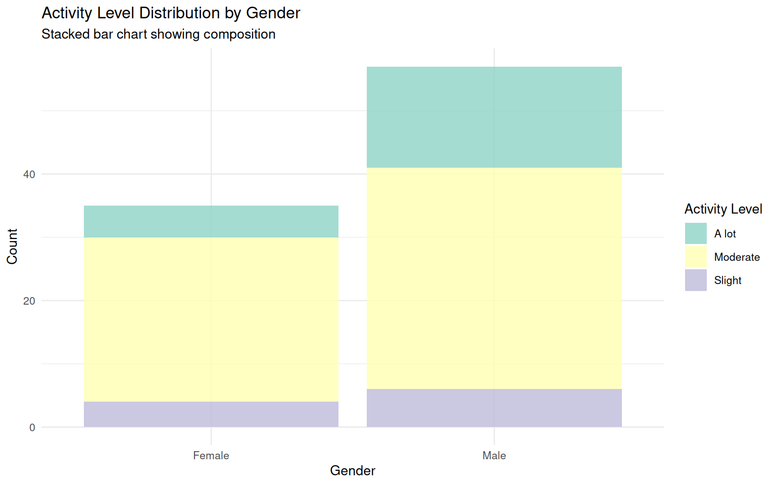
# Grouped bar chart: Activity by Sex
ggplot(pulse_data, aes(x = Sex, fill = Activity)) +
  geom_bar(position = "dodge", alpha = 0.8) +
  labs(title = "Activity Level Comparison by Gender",
       subtitle = "Grouped bar chart for direct comparison",
       x = "Gender",
       y = "Count",
       fill = "Activity Level") +
  theme_minimal(base_size = 10) +
  scale_fill_brewer(palette = "Set3")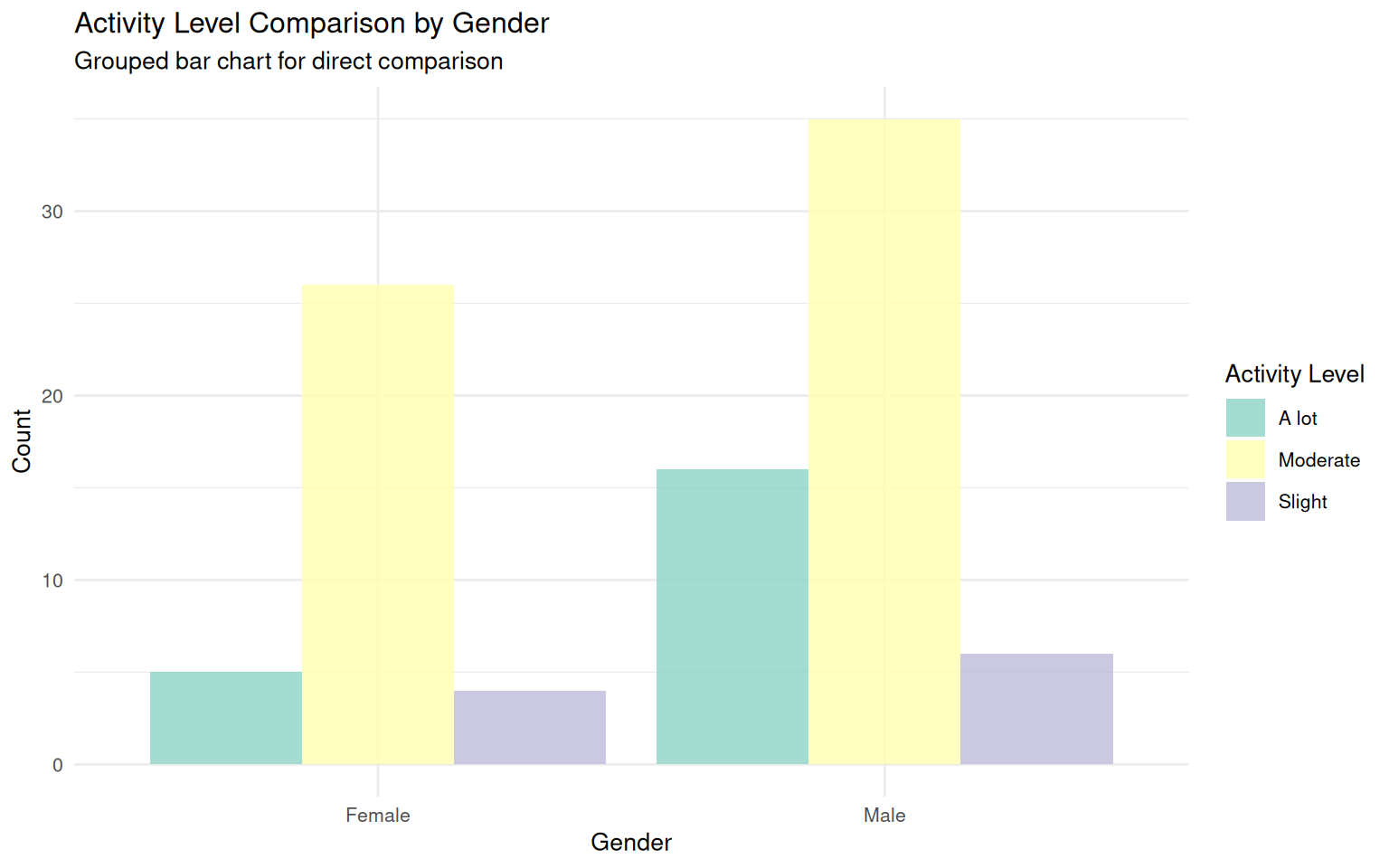
2.3 Basic Probability Calculations
Calculating probabilities from contingency tables and understanding fundamental concepts.
# Total counts for probability calculations
total_students <- nrow(pulse_data)

# P(Female)
female_count <- sum(pulse_data$Sex == "Female")
p_female <- round(female_count / total_students, 4)

# P(Moderate Activity)
moderate_count <- sum(pulse_data$Activity == "Moderate")
p_moderate <- round(moderate_count / total_students, 4)

basic_probabilities <- tibble(
  Event = c("Female", "Moderate Activity"),
  Count = c(female_count, moderate_count),
  Total = total_students,
  Probability = c(p_female, p_moderate)
)

print(basic_probabilities)
# A tibble: 2 × 4
Event Count Total Probability
<chr> <int> <int> <dbl>
1 Female 35 92 0.380
2 Moderate Activity 61 92 0.663There are 92 students in the dataset. The probability that a randomly selected student is female is 0.3804, and the probability that a randomly selected student reports moderate activity is 0.663.
Part 3: Probability Applications
3.1 Joint and Conditional Probabilities
Understanding relationships between events through joint and conditional probability calculations.
# Joint probability: P(Female and Moderate Activity)
female_moderate <- pulse_data |>
  filter(Sex == "Female" & Activity == "Moderate") |>
  nrow()

p_female_moderate <- round(female_moderate / total_students, 4)
p_moderate_given_female <- round(female_moderate / female_count, 4)
p_female_given_moderate <- round(female_moderate / moderate_count, 4)

joint_conditional_probabilities <- tibble(
  Probability = c("P(Female ∩ Moderate Activity)",
                  "P(Moderate Activity | Female)",
                  "P(Female | Moderate Activity)"),
  Value = c(p_female_moderate, p_moderate_given_female, p_female_given_moderate)
)

print(joint_conditional_probabilities)
# A tibble: 3 × 2
Probability Value
<chr> <dbl>
1 P(Female ∩ Moderate Activity) 0.283
2 P(Moderate Activity | Female) 0.743
3 P(Female | Moderate Activity) 0.426The joint probability of being female and reporting moderate activity is 0.2826. Given that a student is female, the conditional probability of moderate activity is 0.7429; given moderate activity, the conditional probability of being female is 0.4262.
3.2 Independence Testing
Examining whether categorical variables are independent using probability concepts.
# Checking independence: P(A and B) vs P(A)P(B)
p_female <- female_count / total_students
p_moderate <- moderate_count / total_students
p_intersection <- female_moderate / total_students
p_product <- p_female * p_moderate

independence_check <- tibble(
  Quantity = c("P(Female) × P(Moderate Activity)",
               "P(Female ∩ Moderate Activity)"),
  Value = round(c(p_product, p_intersection), 4)
)

print(independence_check)
# A tibble: 2 × 2
Quantity Value
<chr> <dbl>
1 P(Female) × P(Moderate Activity) 0.252
2 P(Female ∩ Moderate Activity) 0.283Since P(Female) × P(Moderate Activity) = 0.2522 is not equal to `P(Female ∩ Moderate Activity) = 0.2826, the events do not satisfy the multiplication rule for independence. The events appear dependent.
3.3 Cross-Tabulation Analysis
Advanced analysis of smoking habits and gender relationships.
# Cross-tabulation: Sex vs Smoking status
smoking_table <- pulse_data |>
  count(Sex, Smokes) |>
  pivot_wider(names_from = Smokes, values_from = n, values_fill = 0) |>
  knitr::kable()

smoking_table| Sex | No | Yes |
|---|---|---|
| Female | 27 | 8 |
| Male | 37 | 20 |
# Visualizing smoking patterns by gender
ggplot(pulse_data, aes(x = Sex, fill = Smokes)) +
  geom_bar(position = "fill", alpha = 0.8) +
  labs(title = "Smoking Patterns by Gender",
       subtitle = "Proportional representation of smoking habits",
       x = "Gender",
       y = "Proportion",
       fill = "Smokes Regularly") +
  theme_minimal(base_size = 10) +
  scale_fill_brewer(palette = "Set1") +
  scale_y_continuous(labels = percent)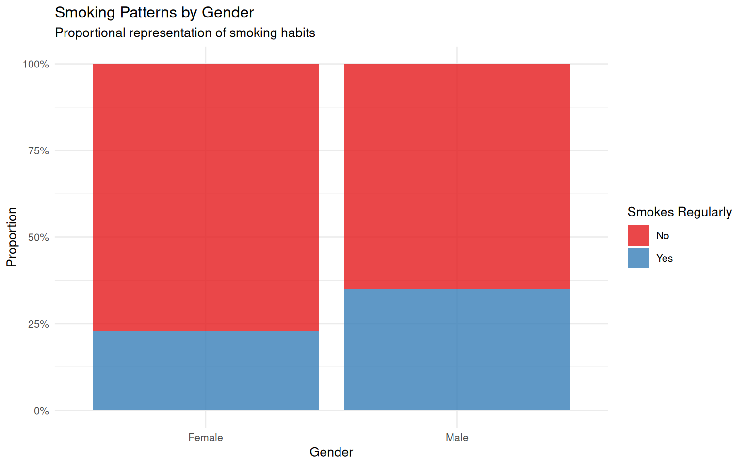
Assessment (Total: 50 points)
Section A: Formative Understanding (15 points)
A1. Explain the difference between joint probability and conditional probability. Provide examples from the Pulse dataset to illustrate each concept. (4 points)
A2. Interpret the relationship between gender and activity levels based on the cross-tabulation analysis. What patterns do you observe, and what might these suggest about activity preferences? (4 points)
A3. Discuss how pie charts and bar charts each contribute differently to understanding categorical data distributions. When would you choose one visualization over the other? (4 points)
A4. Based on your probability calculations, are gender and activity level independent variables? Justify your answer using appropriate probability concepts. (3 points)
Section B: Coding Proficiency (20 points)
B1. Create a comprehensive frequency table for smoking status, including both counts and proportions. Display the results in a well-formatted table. (4 points)
# Your code hereB2. Generate a cross-tabulation showing the relationship between running participation (Ran) and gender. Include both counts and row proportions. (4 points)
# Your code hereB3. Create a grouped bar chart comparing smoking habits between males and females. Include appropriate labels and formatting. (4 points)
# Your code hereB4. Calculate the following probabilities from the Pulse dataset: P(Male), P(Smoker), P(Male and Smoker), and P(Smoker | Male). (4 points)
# Your code hereB5. Test whether gender and smoking status are independent variables using probability concepts. Show your calculations and state your conclusion. (4 points)
# Your code hereSection C: Statistical Synthesis (15 points)
C1. Based on your comprehensive analysis, write a detailed report (200-250 words) discussing the relationships between gender, activity levels, and smoking habits in the Pulse dataset. Include interpretations of probability patterns and potential implications for health research. (7 points)
C2. Propose three specific research questions that could be investigated using categorical data analysis techniques with this dataset. For each question, specify which analytical methods (cross-tabulation, visualization, probability calculations) would be most appropriate. (4 points)
C3. Reflect on the limitations of using probability calculations from sample data to make generalizations about population relationships. What additional considerations should researchers keep in mind when interpreting these results? (4 points)
Submission Guidelines:
- Complete R Markdown document with all code and outputs
- Properly formatted visualizations and statistical summaries
- Professional writing with clear analytical narrative
- Knitted HTML document submitted via designated platform