# Importing the cardiovascular dataset
# Data URL: https://math214.netlify.app/data/Lab1/heart.csv
heart_data <- read.csv("../data/Lab1/heart.csv")

# Importing the automotive dataset
# Data URL: https://math214.netlify.app/data/Lab1/auto_mpg.csv
auto_data <- read.csv("../data/Lab1/auto_mpg.csv")Lab 1: Descriptive Statistics and Data Visualization
Student Name:
Introduction: Exploratory Data Analysis Fundamentals
This laboratory introduces comprehensive descriptive statistics and data visualization techniques, building upon the foundational R programming skills developed in Lab 0. We will explore two complementary datasets to understand different aspects of data analysis.
Learning Objectives
Upon completion of this laboratory, students will be able to:
- Calculate and interpret comprehensive descriptive statistics
- Create and analyze frequency distributions for categorical and continuous variables
- Generate meaningful visualizations using ggplot2 for exploratory analysis
- Compare distributions across different groups and datasets
- Interpret statistical patterns in health and automotive contexts
- Document analytical processes using R Markdown with professional formatting
Time Allocation (Total: 100 minutes)
- Part 1: Foundational Descriptive Statistics (30 minutes)
- Part 2: Comparative Analysis and Grouped Statistics (35 minutes)
- Part 3: Advanced Visualization and Interpretation (35 minutes)
Part 1: Foundational Descriptive Statistics
1.1 Data Import and Initial Exploration
Statistical analysis begins with careful data acquisition and understanding. We will examine two complementary datasets: cardiovascular health data and automotive performance metrics.
The heart disease dataset contains 303 observations with 14 clinical variables including age, cholesterol levels, blood pressure, and heart disease diagnosis. The auto MPG dataset contains 398 observations with 9 vehicle performance metrics including fuel efficiency, engine specifications, and manufacturer information.
1.2 Basic Descriptive Statistics with Base R
Traditional R syntax provides robust tools for initial data exploration and summary statistics.
# Comprehensive summary of cholesterol levels
summary(heart_data$chol)
Min. 1st Qu. Median Mean 3rd Qu. Max.
126.0 211.0 240.0 246.3 274.5 564.0 # compute stats
chol_stats <- heart_data$chol
length(chol_stats) # n[1] 303min(chol_stats, na.rm = TRUE) # min[1] 126max(chol_stats, na.rm = TRUE) # max[1] 564round(mean(chol_stats, na.rm = TRUE), 2) # mean[1] 246.26median(chol_stats, na.rm = TRUE) # median[1] 240round(sd(chol_stats, na.rm = TRUE), 2) # sd[1] 51.831.3 Automated Descriptive Statistics Function
Creating reusable functions enhances analytical efficiency and reproducibility.
# Comprehensive descriptive statistics function
DesStat <- function(datacol, title) {
  datasummary <- tibble(
    N = length(datacol),
    min = min(datacol, na.rm = TRUE),
    firstQ = quantile(datacol, 0.25, na.rm = TRUE),
    median = median(datacol, na.rm = TRUE),
    thirdQ = quantile(datacol, 0.75, na.rm = TRUE),
    max = max(datacol, na.rm = TRUE),
    mean = round(mean(datacol, na.rm = TRUE), 3),
    StDev = round(sd(datacol, na.rm = TRUE), 3),
    Var = round(var(datacol, na.rm = TRUE), 3)
  )

  # Create flextable and add title as caption
  datasummary_ft <- flextable(datasummary) |>
    set_caption(caption = title) |>
    theme_booktabs() |>
    autofit()

  return(datasummary_ft)
}

# Usage
mpg_stats <- DesStat(auto_data$mpg, "Automotive Fuel Efficiency Statistics")
mpg_stats
N | min | firstQ | median | thirdQ | max | mean | StDev | Var |
|---|---|---|---|---|---|---|---|---|
398 | 9 | 17.5 | 23 | 29 | 46.6 | 23.515 | 7.816 | 61.09 |
Part 2: Comparative Analysis and Grouped Statistics
2.1 Data Transformation and Recoding
Preparing categorical variables for meaningful analysis enhances interpretability.
# Recoding heart disease status for clarity
heart_data <- heart_data |>
  mutate(heart_disease = ifelse(target == 1, "Present", "Absent"))

# Recoding vehicle origin
auto_data <- auto_data |>
  mutate(origin = case_when(
    origin == 1 ~ "American",
    origin == 2 ~ "European",
    origin == 3 ~ "Japanese",
    TRUE ~ as.character(origin)
  ))
2.2 Grouped Descriptive Statistics
Comparative analysis across groups reveals important patterns and relationships.
# Cholesterol statistics by heart disease status
heart_data |>
  group_by(heart_disease) |>
  summarise(
    n_patients = n(),
    mean_chol = mean(chol, na.rm = TRUE),
    median_chol = median(chol, na.rm = TRUE),
    sd_chol = sd(chol, na.rm = TRUE),
    min_chol = min(chol, na.rm = TRUE),
    max_chol = max(chol, na.rm = TRUE)
) |> knitr::kable()| heart_disease | n_patients | mean_chol | median_chol | sd_chol | min_chol | max_chol |
|---|---|---|---|---|---|---|
| Absent | 138 | 251.0870 | 249 | 49.45461 | 131 | 409 |
| Present | 165 | 242.2303 | 234 | 53.55287 | 126 | 564 |
# MPG statistics by vehicle origin
auto_data |>
  group_by(origin) |>
  summarise(
    n_vehicles = n(),
    mean_mpg = mean(mpg, na.rm = TRUE),
    median_mpg = median(mpg, na.rm = TRUE),
    sd_mpg = sd(mpg, na.rm = TRUE),
    min_mpg = min(mpg, na.rm = TRUE),
    max_mpg = max(mpg, na.rm = TRUE)
) |> knitr::kable()| origin | n_vehicles | mean_mpg | median_mpg | sd_mpg | min_mpg | max_mpg |
|---|---|---|---|---|---|---|
| American | 249 | 20.08353 | 18.5 | 6.402892 | 9.0 | 39.0 |
| European | 70 | 27.89143 | 26.5 | 6.723930 | 16.2 | 44.3 |
| Japanese | 79 | 30.45063 | 31.6 | 6.090048 | 18.0 | 46.6 |
2.3 Frequency Distributions and Cross-Tabulation
Understanding variable distributions and relationships between categorical variables.
# Frequency distribution of heart disease by gender
heart_data |>
  count(sex, heart_disease)
sex heart_disease n
1 0 Absent 24
2 0 Present 72
3 1 Absent 114
4 1 Present 93# Frequency distribution of vehicles by origin and cylinders
auto_data |>
count(origin, cylinders) origin cylinders n
1 American 4 72
2 American 6 74
3 American 8 103
4 European 4 63
5 European 5 3
6 European 6 4
7 Japanese 3 4
8 Japanese 4 69
9 Japanese 6 6Part 3: Advanced Visualization and Interpretation
3.1 Univariate Distribution Visualization
Visual representation facilitates understanding of data distributions and patterns.
# Cholesterol distribution histogram
ggplot(heart_data, aes(x = chol)) +
  geom_histogram(binwidth = 20, fill = "steelblue", color = "black", alpha = 0.7) +
  labs(title = "Distribution of Cholesterol Levels",
       subtitle = "Histogram showing frequency distribution of cholesterol values",
       x = "Cholesterol (mg/dl)",
       y = "Frequency") +
  theme_minimal(base_size = 10)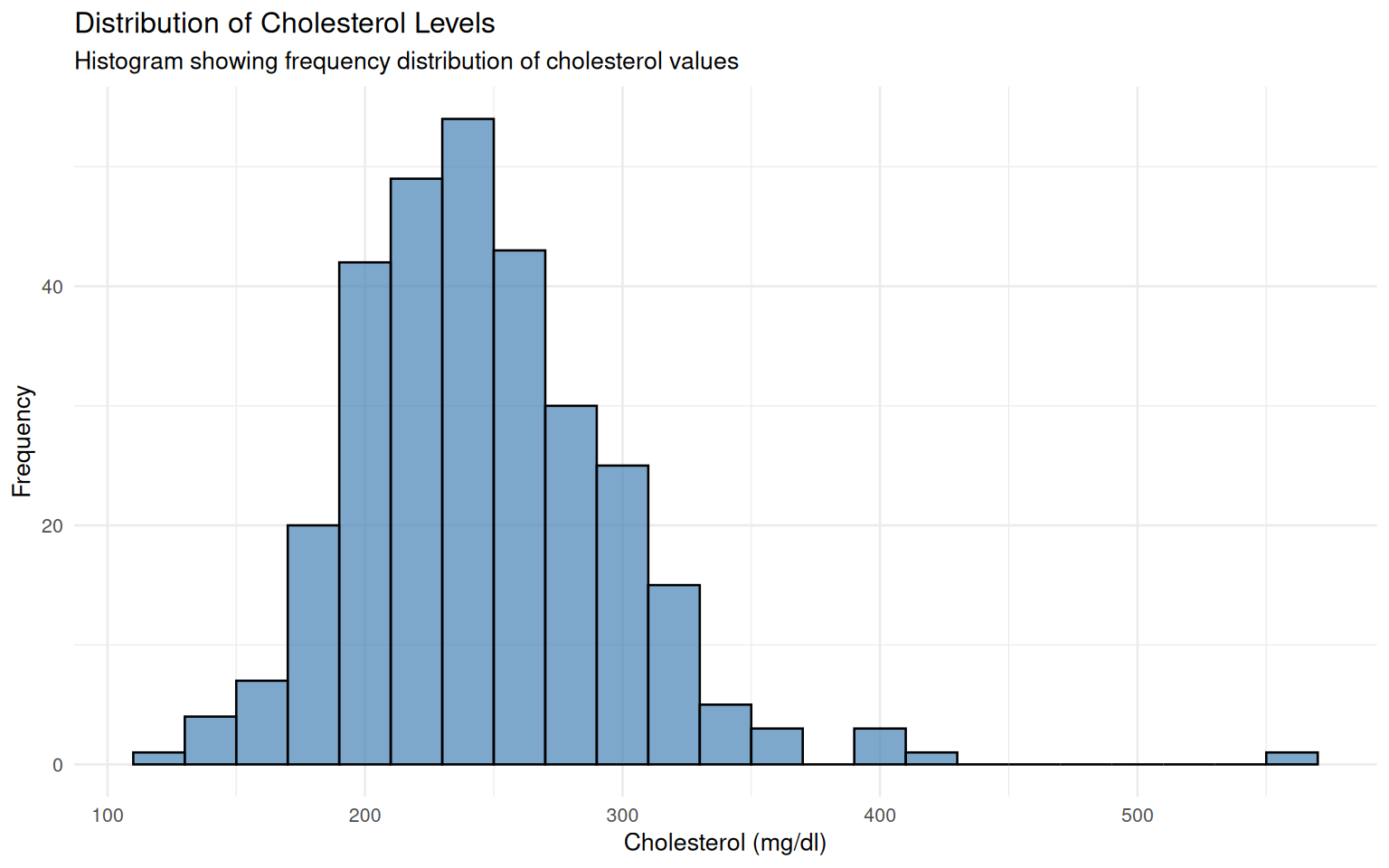
# MPG distribution by origin
ggplot(auto_data, aes(x = mpg, fill = origin)) +
  geom_histogram(binwidth = 2, alpha = 0.7, position = "identity") +
  labs(title = "Fuel Efficiency Distribution by Vehicle Origin",
       subtitle = "Comparative histogram showing MPG distributions across different origins",
       x = "Miles per Gallon",
       y = "Count",
       fill = "Vehicle Origin") +
  theme_minimal(base_size = 10)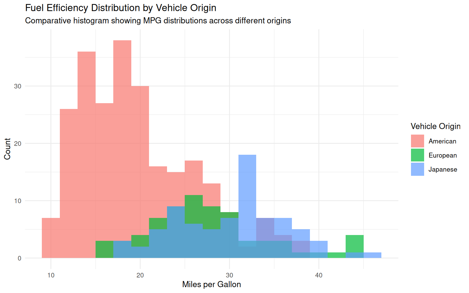
3.2 Comparative Boxplot Analysis
Boxplots provide excellent visual summaries for comparative analysis across groups.
# Cholesterol levels by heart disease status
ggplot(heart_data, aes(x = heart_disease, y = chol, fill = heart_disease)) +
  geom_boxplot(alpha = 0.7) +
  labs(title = "Cholesterol Levels by Heart Disease Status",
       subtitle = "Boxplot comparison showing distribution differences",
       x = "Heart Disease Status",
       y = "Cholesterol (mg/dl)",
       fill = "Status") +
theme_minimal(base_size = 10) 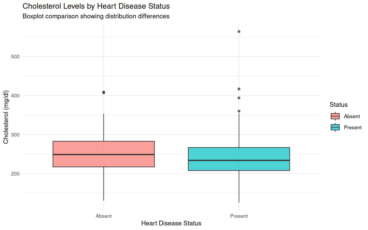
# MPG by number of cylinders
ggplot(auto_data, aes(x = factor(cylinders), y = mpg, fill = factor(cylinders))) +
  geom_boxplot(alpha = 0.7) +
  labs(title = "Fuel Efficiency by Number of Cylinders",
       subtitle = "Boxplot showing relationship between engine size and fuel economy",
       x = "Number of Cylinders",
       y = "Miles per Gallon",
       fill = "Cylinders") +
  theme_minimal(base_size = 10)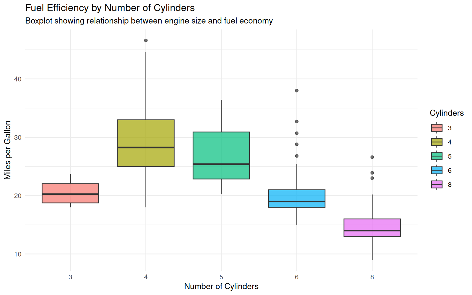
3.3 Scatterplot Relationships
Examining relationships between continuous variables reveals underlying patterns.
# Age vs Cholesterol with heart disease status
ggplot(heart_data, aes(x = age, y = chol, color = heart_disease)) +
  geom_point(alpha = 0.6, size = 3) +
  labs(title = "Age and Cholesterol Relationship by Heart Disease Status",
       subtitle = "Scatterplot showing potential risk factors for cardiovascular health",
       x = "Age (years)",
       y = "Cholesterol (mg/dl)",
       color = "Heart Disease") +
  theme_minimal(base_size = 10)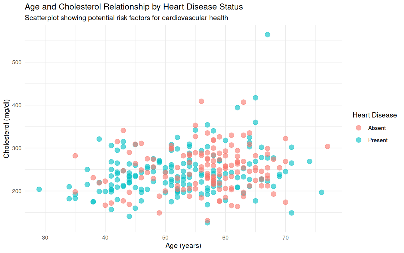
# Engine displacement vs MPG by origin
ggplot(auto_data, aes(x = displacement, y = mpg, color = origin)) +
  geom_point(alpha = 0.6, size = 2) +
  labs(title = "Engine Displacement vs Fuel Efficiency by Origin",
       subtitle = "Scatterplot showing engineering trade-offs across different manufacturers",
       x = "Engine Displacement (cubic inches)",
       y = "Miles per Gallon",
       color = "Vehicle Origin") +
  theme_minimal(base_size = 10)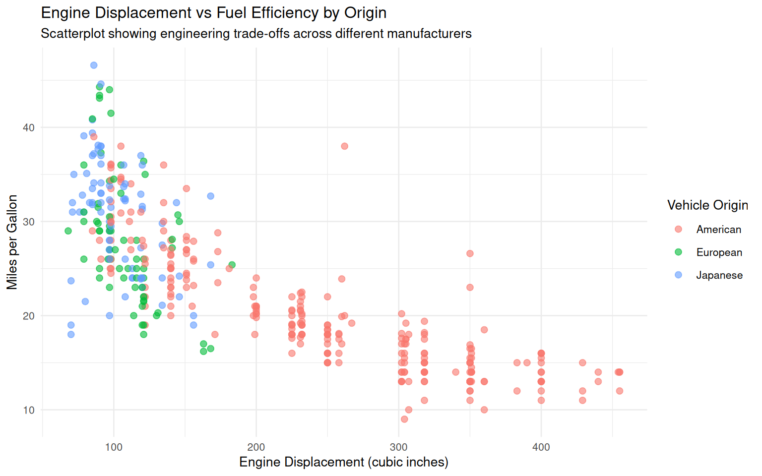
Assessment (Total: 50 points)
Section A: Formative Understanding (15 points)
A1. Explain the difference between measures of central tendency (mean, median) and measures of dispersion (standard deviation, IQR). Why are both types of measures necessary for comprehensive data description? (3 points)
A2. Interpret the boxplot of cholesterol levels by heart disease status. What patterns do you observe, and what might these suggest about the relationship between cholesterol and heart disease? (4 points)
A3. Discuss the importance of data visualization in exploratory data analysis. How do histograms, boxplots, and scatterplots each contribute differently to understanding dataset characteristics? (4 points)
A4. Compare the MPG distributions across different vehicle origins. What generalizations can you make about fuel efficiency based on manufacturing region? (4 points)
Section B: Coding Proficiency (20 points)
B1. Calculate and display comprehensive descriptive statistics for resting blood pressure (trestbps) from the heart dataset, including mean, median, standard deviation, and quartiles. (4 points)
# Your code hereB2. Create a frequency table showing the distribution of vehicles by both origin and number of cylinders. Display the results in a well-formatted table. (4 points)
# Your code hereB3. Generate a comparative boxplot showing the distribution of horsepower by vehicle origin. Include appropriate labels and formatting. (4 points)
# Your code hereB4. Calculate the average cholesterol levels for patients with and without heart disease, and compute the difference between these averages. (4 points)
# Your code hereB5. Create a scatterplot showing the relationship between vehicle weight and MPG, colored by number of cylinders. Provide meaningful interpretation of the observed pattern. (4 points)
# Your code hereSection C: Statistical Synthesis (15 points)
C1. Based on your analysis of both datasets, write a comprehensive comparison (200-250 words) discussing how the different variable types (clinical health metrics vs engineering performance metrics) influence the appropriate analytical approaches and interpretations. (7 points)
C2. Propose three specific research questions that could be investigated using the heart dataset, specifying which analytical techniques (descriptive statistics, visualizations, inferential tests) would be most appropriate for each question. (4 points)
C3. Reflect on the limitations of the auto MPG dataset for making generalizations about vehicle performance. What additional variables would be necessary to conduct a more comprehensive analysis of automotive efficiency? (4 points)
Submission Guidelines:
- Complete R Markdown document with all code and outputs
- Properly formatted visualizations and statistical summaries
- Professional writing with clear analytical narrative
- Knitted HTML document submitted via designated platform